
Episode 121
에피소드 성수 121은 SK D&D에서 운영하는 1인 가구 맞춤형 주거 공간입니다. 론칭 당시, 저는 공간 내 다양한 그래픽 디자인을 담당하는 메인 디자이너로 참여하였습니다. 특히, 정문에 일반적인 간판이 아닌 벽면에 브랜드 로고를 입히는 작업을 진행하여, 방문객들이 입장시 공간에 더 몰입할 수 있는 시각적 임팩트를 함께 전달하려고 노력하였습니다.
Episode Seongsu 121 is a residential space tailored for single-person households, operated by SK D&D. During its launch, I participated as the lead designer, overseeing various graphic design elements within the space. In particular, instead of installing a conventional signboard, I applied the brand logo directly onto the wall at the main entrance. This approach aimed to provide visitors with a strong visual impact, allowing them to immerse themselves more deeply in the space upon entry.
Year
2020
Category
Sign
Company
SK D&D
Role
Graphic Designer (100%)
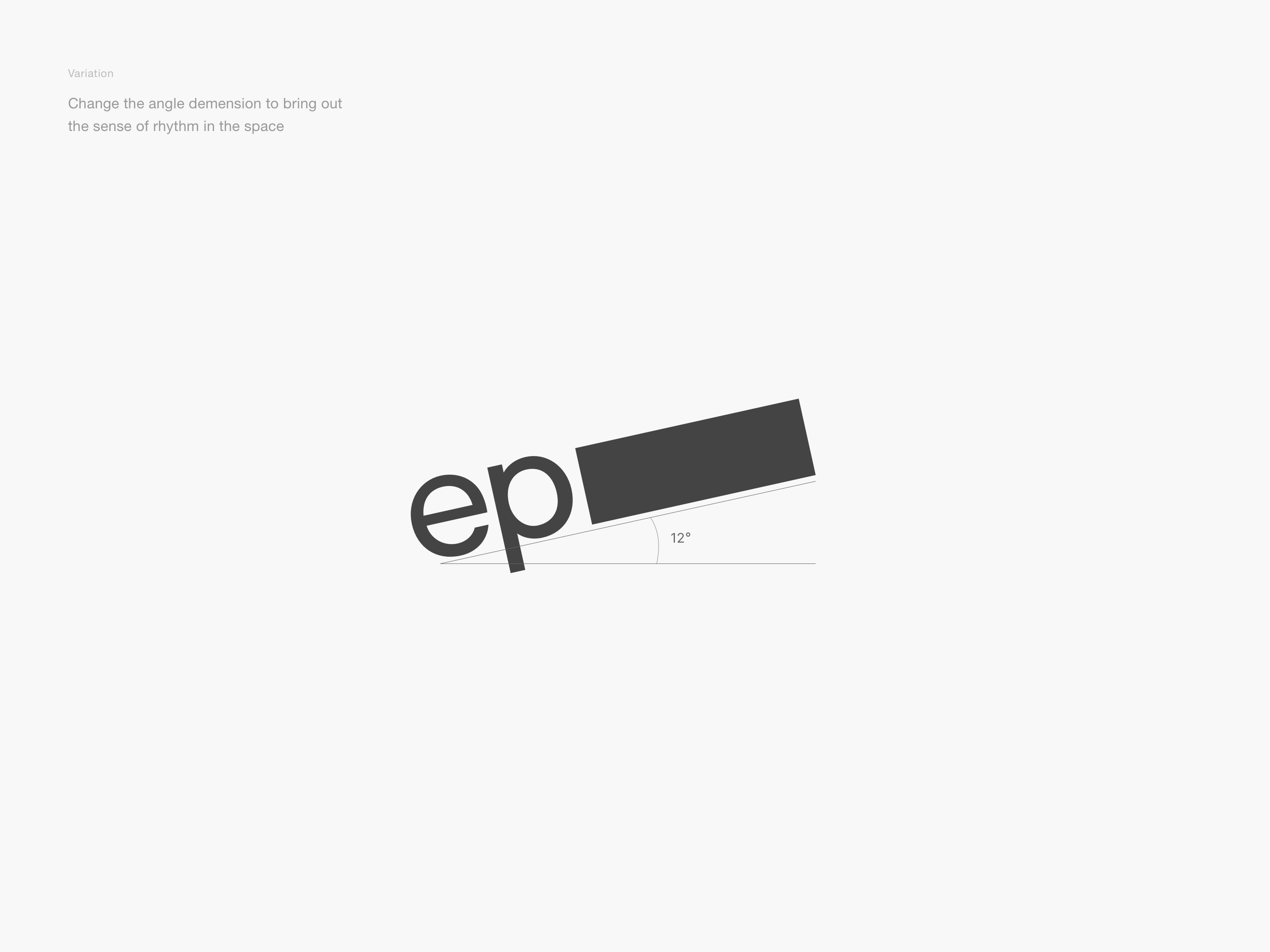
공간 그래픽
간판이 아닌 공간 그래픽으로 입장시 공간에 몰입할 수 있게 한다
일반적인 간판 형태에 로고를 배치하는 것이 아니라, 공간과 조화를 이루면서 입장시 공간에 더욱 몰입할 수 있는 공간 그래픽 요소로 풀어내는 방향을 선택하였습니다. 또한, 로고를 정적인 형태로 배치하는 대신, 각도를 변형하여 리듬감을 부여함으로써 공간에 더욱 생동감과 재미를 더하고자 하였습니다.
Rather than simply placing the logo in a conventional signboard format, we chose to integrate it as a spatial graphic element that harmonizes with the environment and enhances immersion upon entry. Additionally, instead of positioning the logo in a static form, we adjusted its angles to create a sense of rhythm, adding vibrancy and visual interest to the space.

디자인
로비 벽면 전체와 로고를 일부 전달하여 공간 그래픽을 극대화한다
로비를 지나면서 에피소드 121의 공간감을 온전히 경험할 수 있도록, 로비의 오른쪽 벽 전체를 활용하는 방향을 선택하였습니다. 또한, 로고를 단순히 배치하는 대신, 일부를 절단하여 간판이 아닌 공간 그래픽 요소로 작용하도록 디자인함으로써, 공간과의 자연스러운 조화를 극대화하였습니다.
To allow visitors to fully experience the spatial atmosphere of Episode 121 as they walk through the lobby, I decided to utilize the entire right wall. Instead of simply placing the logo as it is, I strategically cut and integrated it into the design, transforming it from a conventional signboard into a spatial graphic element that blends seamlessly with the environment.

질감
노출 콘크리트와 어울리는 거친 질감과 무광 마감으로 질감을 표현한다
입구 로비는 노출 콘크리트 벽으로 마감되어 있었습니다. 반짝이거나 매끈한 질감의 그래픽 요소는 노출 콘크리트와 어울리지 않을 것이라 판단했으며, 공간과 그래픽 사이의 이질감을 최소화하는 것이 중요하다고 생각했습니다. 이에 따라, 거친 질감과 무광 마감이 공간과 조화를 이루기에 더 적합하다고 결정하였고, 로고를 벽에 직접 적용한 후 샌딩 처리하여 자연스럽고 텍스처감 있는 표면을 구현하였습니다.
The entrance lobby was finished with exposed concrete walls. I determined that glossy or smooth-textured graphic elements would not harmonize well with the raw concrete, and minimizing the contrast between the space and the graphic was essential. As a result, I decided that a rough texture and matte finish would better complement the space. I applied the logo directly to the wall and sanded it to create a naturally textured surface, enhancing its integration with the surrounding environment.


Marina Hill Jeju