
IBM XiV
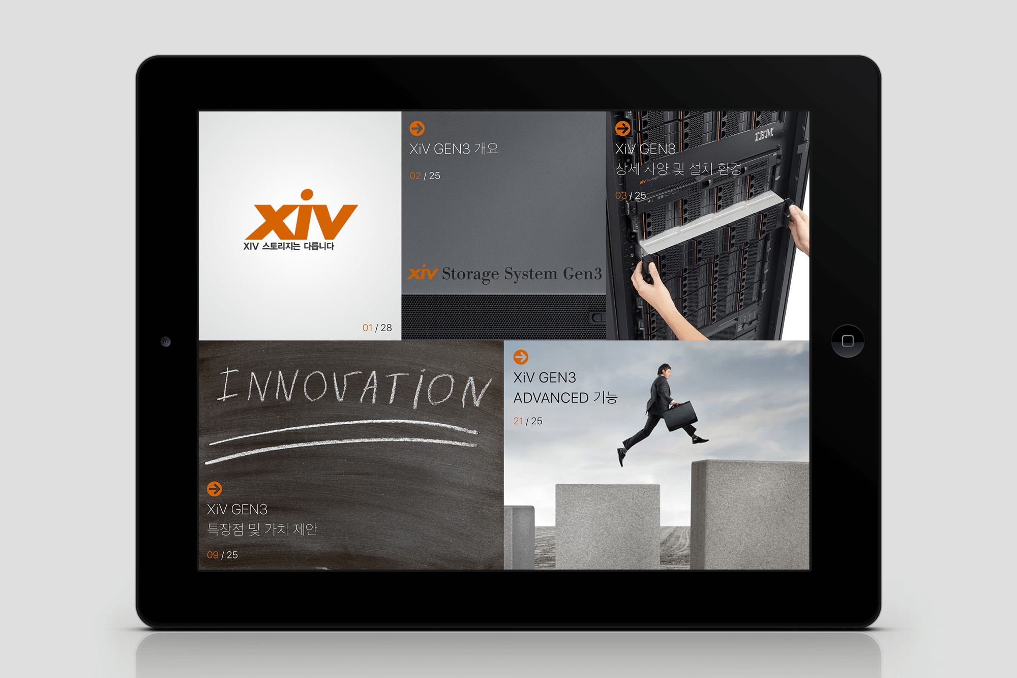
IBM은 B2B 제품을 클라이언트에게 영업할 때, 전통적으로 종이 브로슈어를 제작하여 활용해왔습니다. 그러나 제품이 업데이트될 때마다 새로운 브로슈어를 제작해야 하는 번거로움이 있었으며, 종이 브로슈어의 물리적 한계로 인해 정보 전달 및 활용에 있어 여러 불편함이 발생했습니다. 이에 오길비 코리아 디지털팀은 E-브로슈어를 제안하였고, IBM XiV의 디스크 스토리지 서버 GEN3를 소개하는 태블릿 애플리케이션을 개발하게 되었습니다. 이 애플리케이션은 콘텐츠를 보다 효과적으로 전달하기 위해 그리드 시스템과 색상 체계를 활용하여 디자인되었으며, 이를 통해 사용자들이 방대한 정보를 보다 체계적으로 탐색하고 쉽게 이해할 수 있도록 설계되었습니다.
IBM traditionally used printed brochures to market its B2B products to clients. However, each product update required the creation of new brochures, which was both time-consuming and inefficient. Additionally, the physical limitations of printed brochures often led to challenges in information delivery and usability. To address these issues, the Ogilvy Korea Digital Team proposed the E-brochure concept and developed a tablet application to introduce the IBM XiV disk storage server GEN3. This application was designed using a grid system and a structured color scheme to enhance content organization and visual clarity. As a result, users can efficiently navigate and comprehend large volumes of information in a more structured and user-friendly manner.
Year
2012
OS
Tablet
Company
Ogilvy Korea
Role
PM (100%), Product Designer (100%)
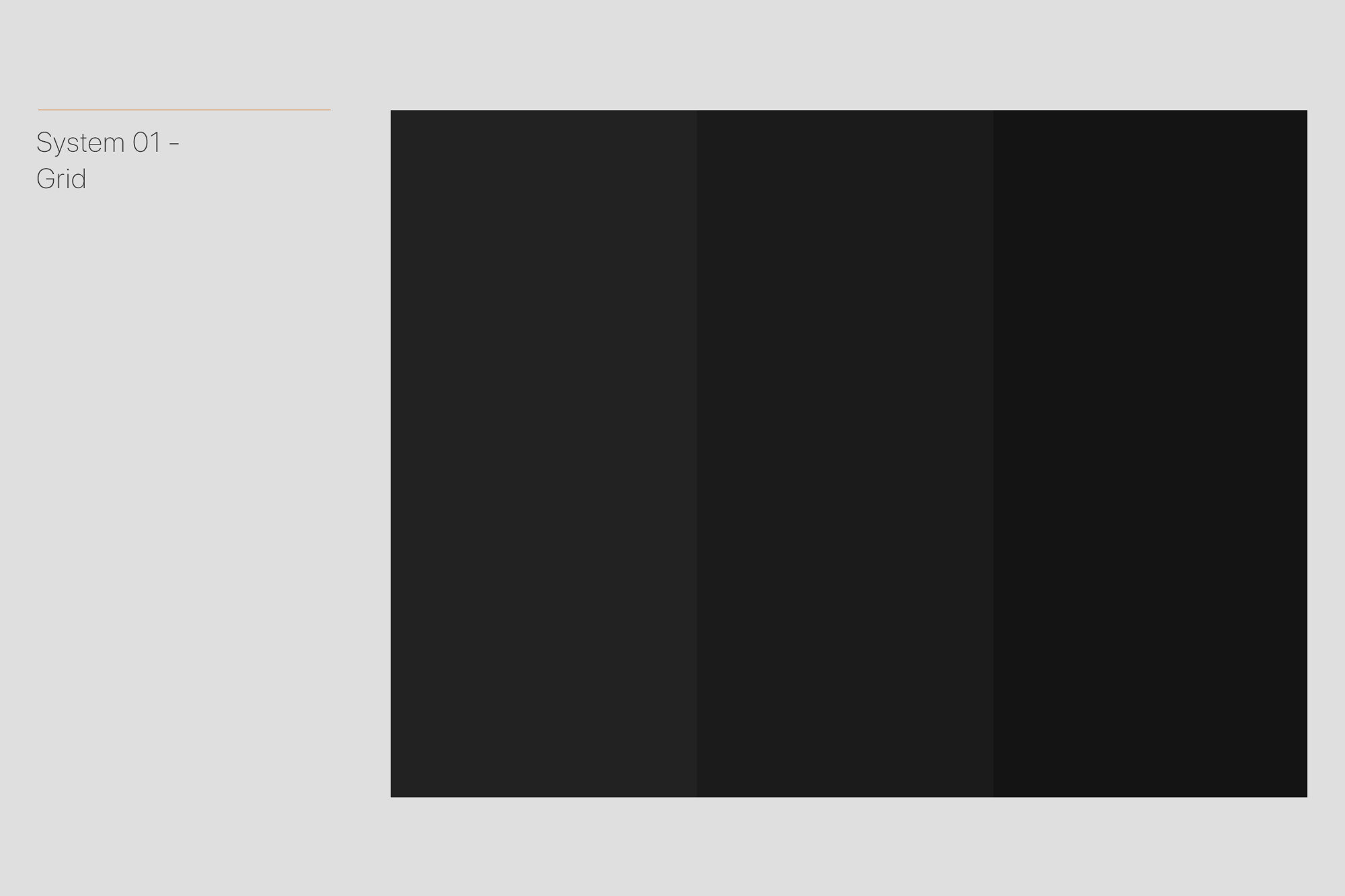
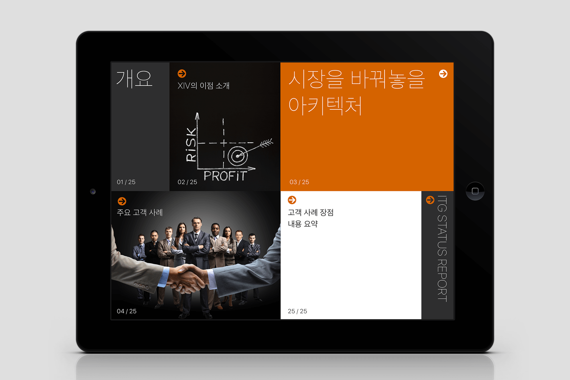
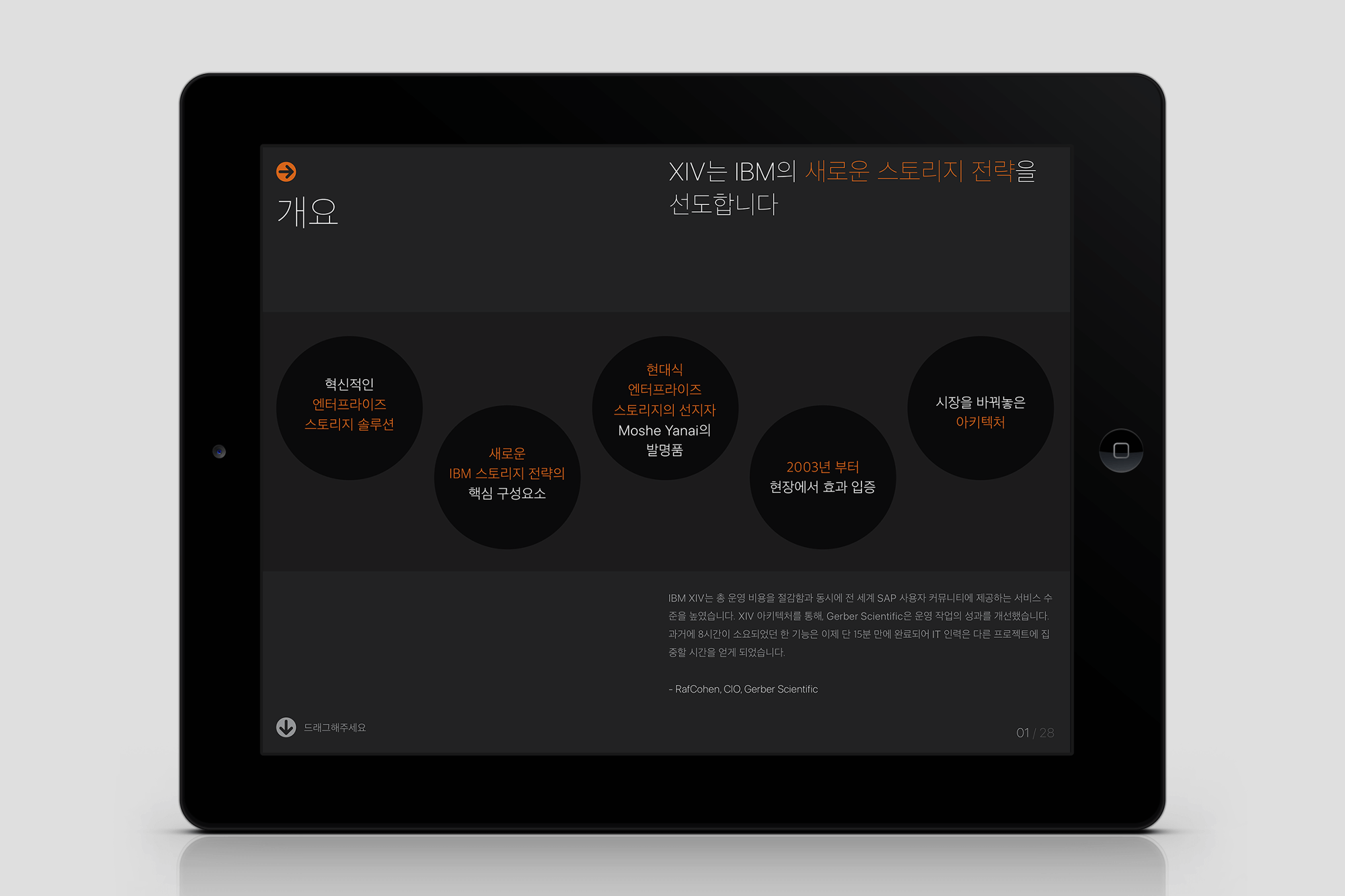
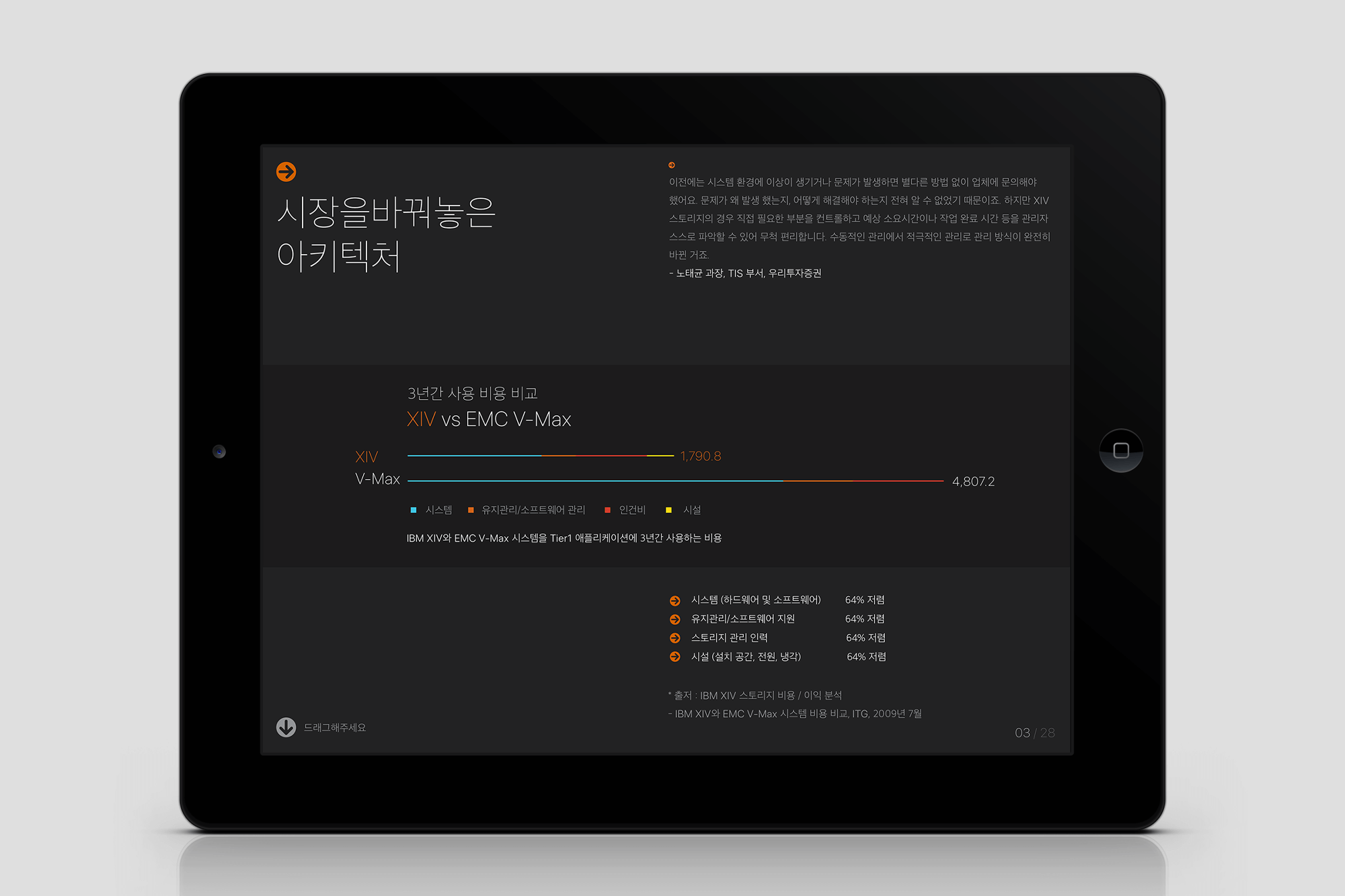
그리드
콘텐츠의 구조에 맞춘 3단 그리드로 위계와 배치를 직관적으로 이해할 수 있게 한다
그리드 시스템은 복잡한 정보를 효과적으로 전달하기 위해 각 콘텐츠를 체계적으로 정리하고 구조화하는 역할을 합니다. 콘텐츠의 기본 구성 요소인 제목, 부제 1, 부제 2를 기반으로 3단 그리드 시스템을 적용하여, 사용자가 콘텐츠의 위계와 배치를 직관적으로 이해할 수 있도록 설계하였습니다.
The grid system is designed to systematically organize and structure content for the effective delivery of complex information. By applying a three-tier grid system based on the fundamental content structure of title, subtitle 1, and subtitle 2, users can intuitively understand the hierarchy and placement of information.
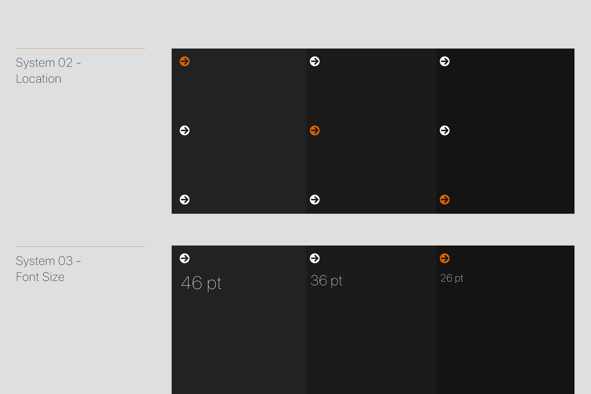
위치 정보
색상과 폰트 사이즈를 통해 콘텐츠의 위치를 직관적으로 알려준다
오렌지 색상 화살표는 사용자가 현재 속한 콘텐츠의 위치를 직관적으로 알 수 있게 도와주는 안내 역할을 합니다. 또한, 제목, 부제 1, 부제 2의 글자 크기를 다르게 하여 콘텐츠의 위계 구조를 명확하게 표현하였습니다.
The orange-colored arrow serves as a visual guide, helping users intuitively recognize their current position within the content. Additionally, varying the font sizes for the title, subtitle 1, and subtitle 2 clearly defines the content hierarchy.
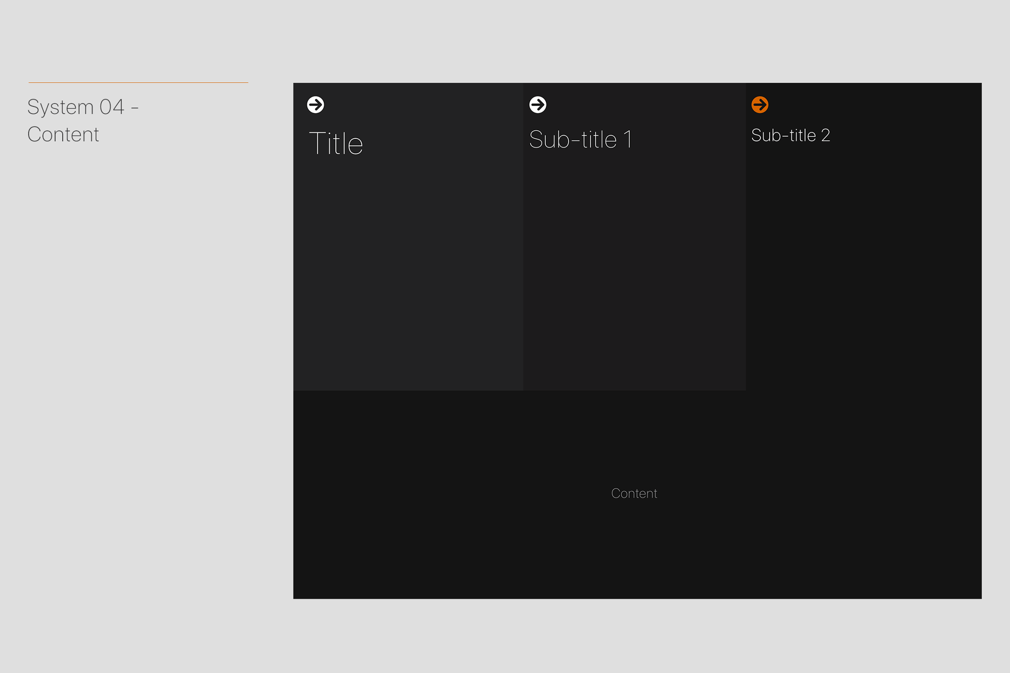
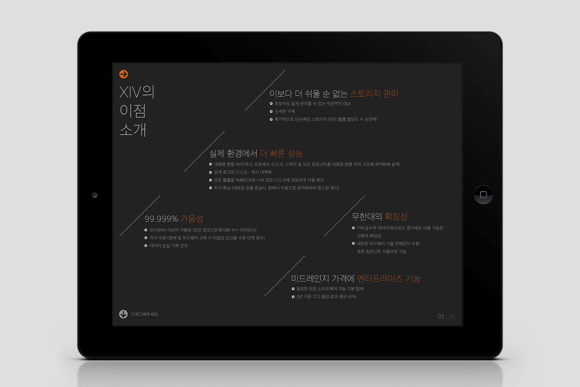
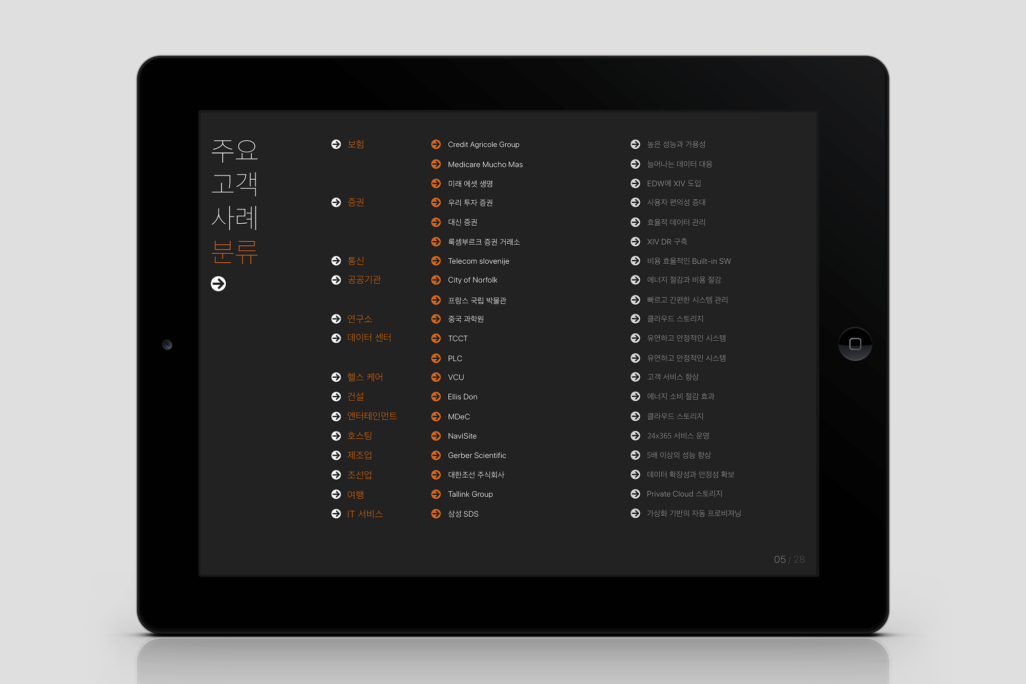
콘텐츠
콘텐츠 영역을 유연하게 확장할 수 있게 설계한다
콘텐츠의 양이 많아 3단 그리드 내에서 적절하게 배치하기 어려운 경우를 대비해, 그리드 영역의 배경색을 구분하여 가독성을 높였습니다. 이를 통해, 콘텐츠 영역을 유연하게 확장하거나 축소할 수 있도록 설계하였으며, 다양한 형태로 콘텐츠를 분할 및 배치할 수 있도록 최적화하였습니다.
To accommodate cases where a large amount of content makes it difficult to fit within the three-stage grid system, background colors were differentiated to enhance readability. This design allows content areas to be flexibly expanded or reduced, optimizing the layout for efficient segmentation and arrangement in various formats.
29CM SNS Guide