Earthquake
화재, 태풍, 홍수, 지진 등 자연재해의 발생이 지속적으로 증가하면서, 우리는 예측하기 어려운 위험에 끊임없이 노출되고 있습니다. 특히, 지진은 순간적으로 발생하여 사전 대비가 어려운 가장 취약한 재해 중 하나입니다. 이러한 문제를 해결하기 위해, 지진 검색 서비스을 통해 사용자가 거주 지역이나 여행지 등 특정 지역으로 이동할 때 해당 지역의 지진 정보를 미리 확인할 수 있도록 합니다. 이를 통해, 보다 효과적인 대비와 신속한 대응이 가능하도록 하여 궁극적으로 개인의 안전을 확보하는 것이 이 서비스의 목표입니다.
As natural disasters such as fires, typhoons, floods, and earthquakes continue to increase, we are constantly exposed to unpredictable risks. In particular, earthquakes occur suddenly, making them one of the most vulnerable disasters that are difficult to prepare for in advance. To address this issue, the earthquake monitoring service allows users to check earthquake information in advance when moving to a specific location, whether it is their residential area or a travel destination. By providing this information, the service aims to enhance preparedness, enable quick responses, and ultimately ensure personal safety.
Year
2015
OS
Web
Company
Personal
Role
PM (100%), Product Designer (100%)
설계 방식
지진 데이터 수집 후 가독성과 사용성을 최적화한다
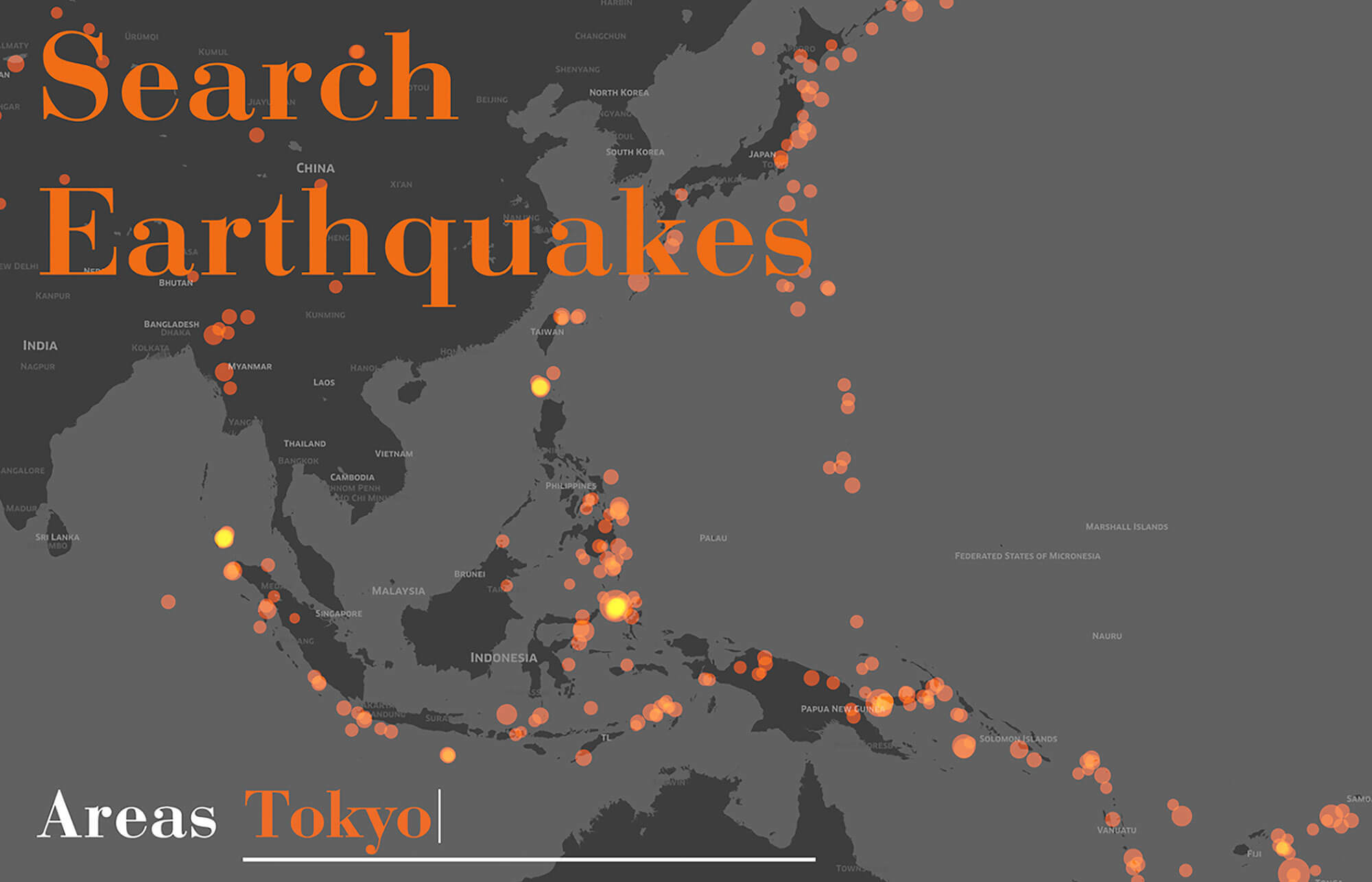
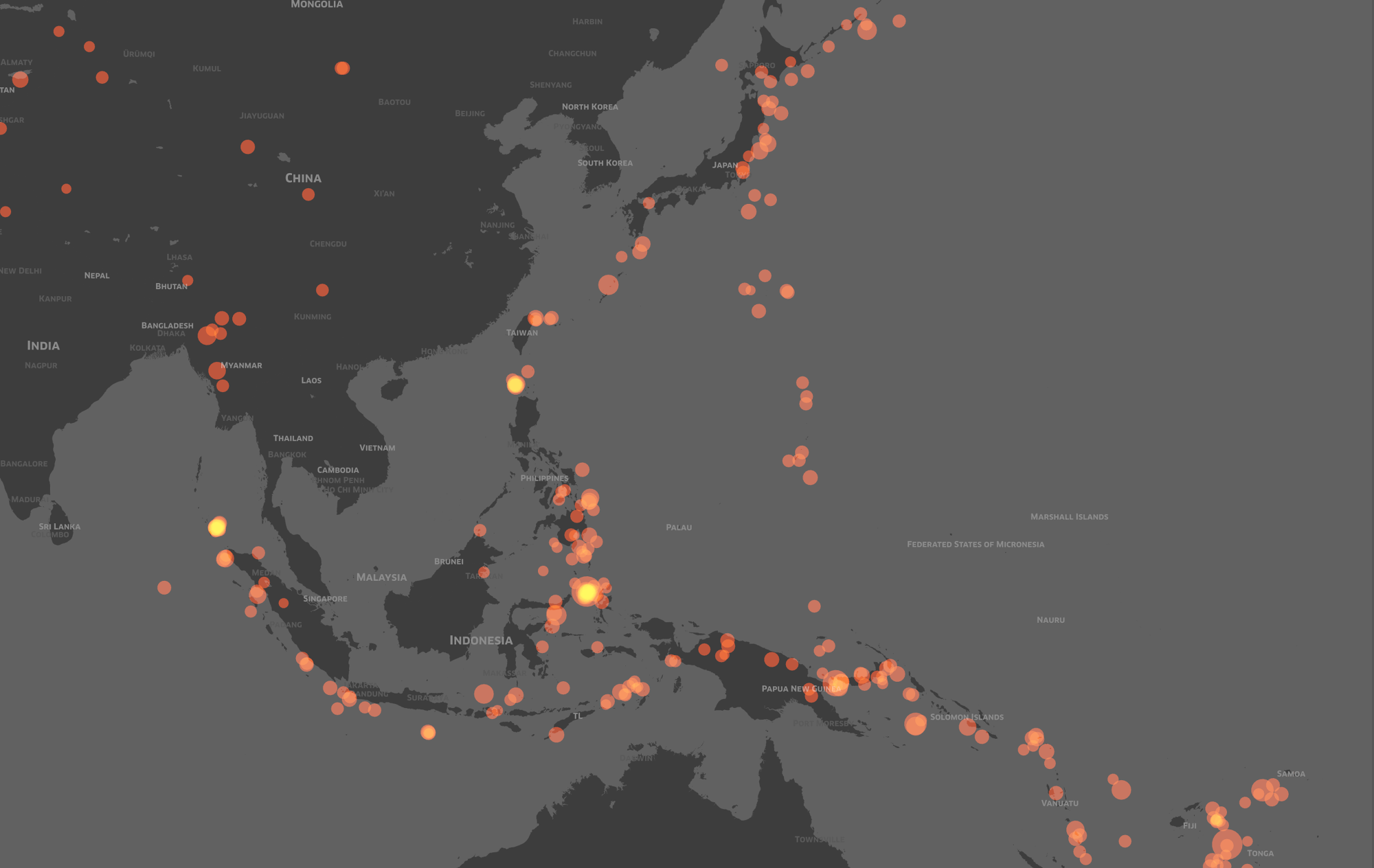
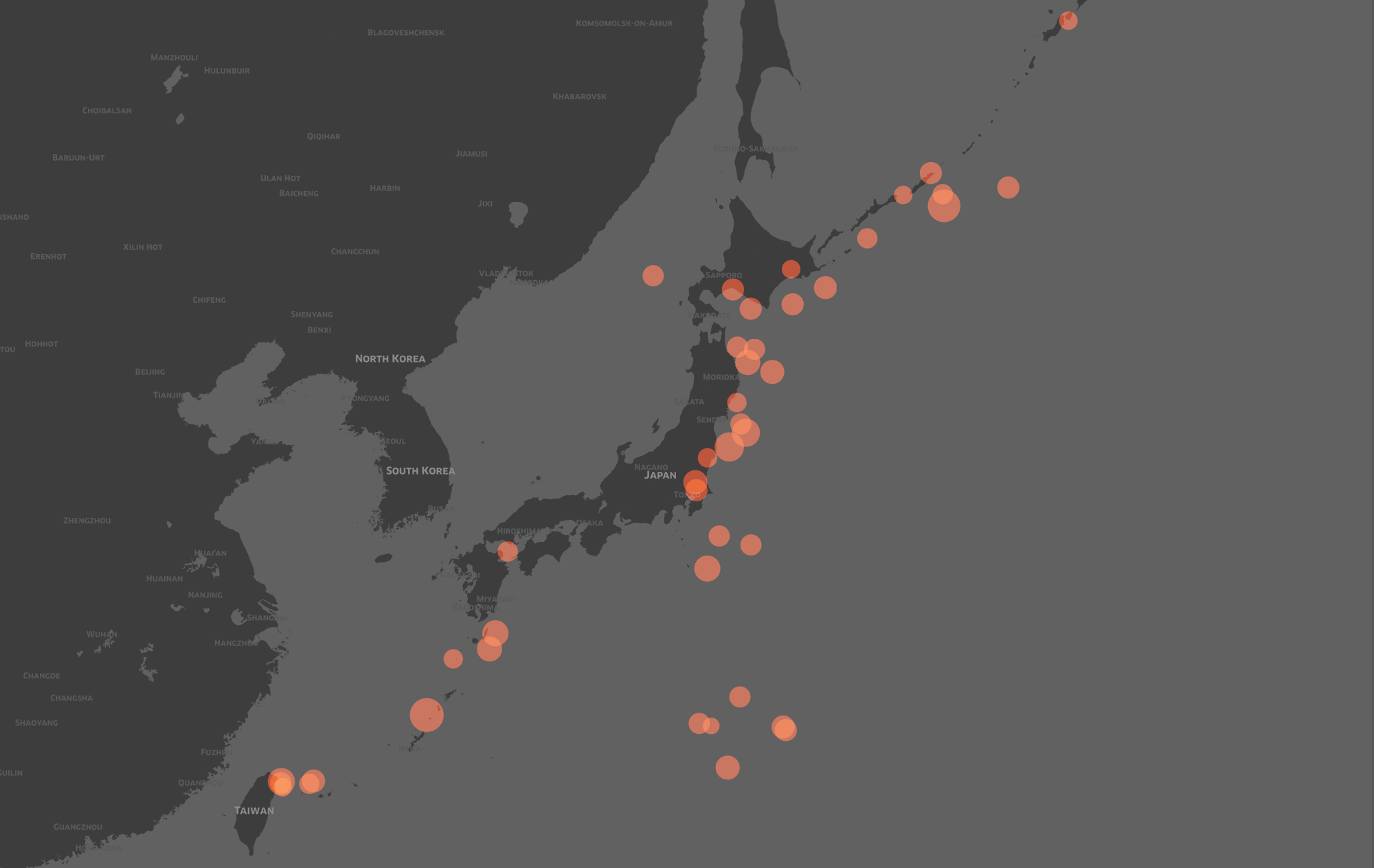
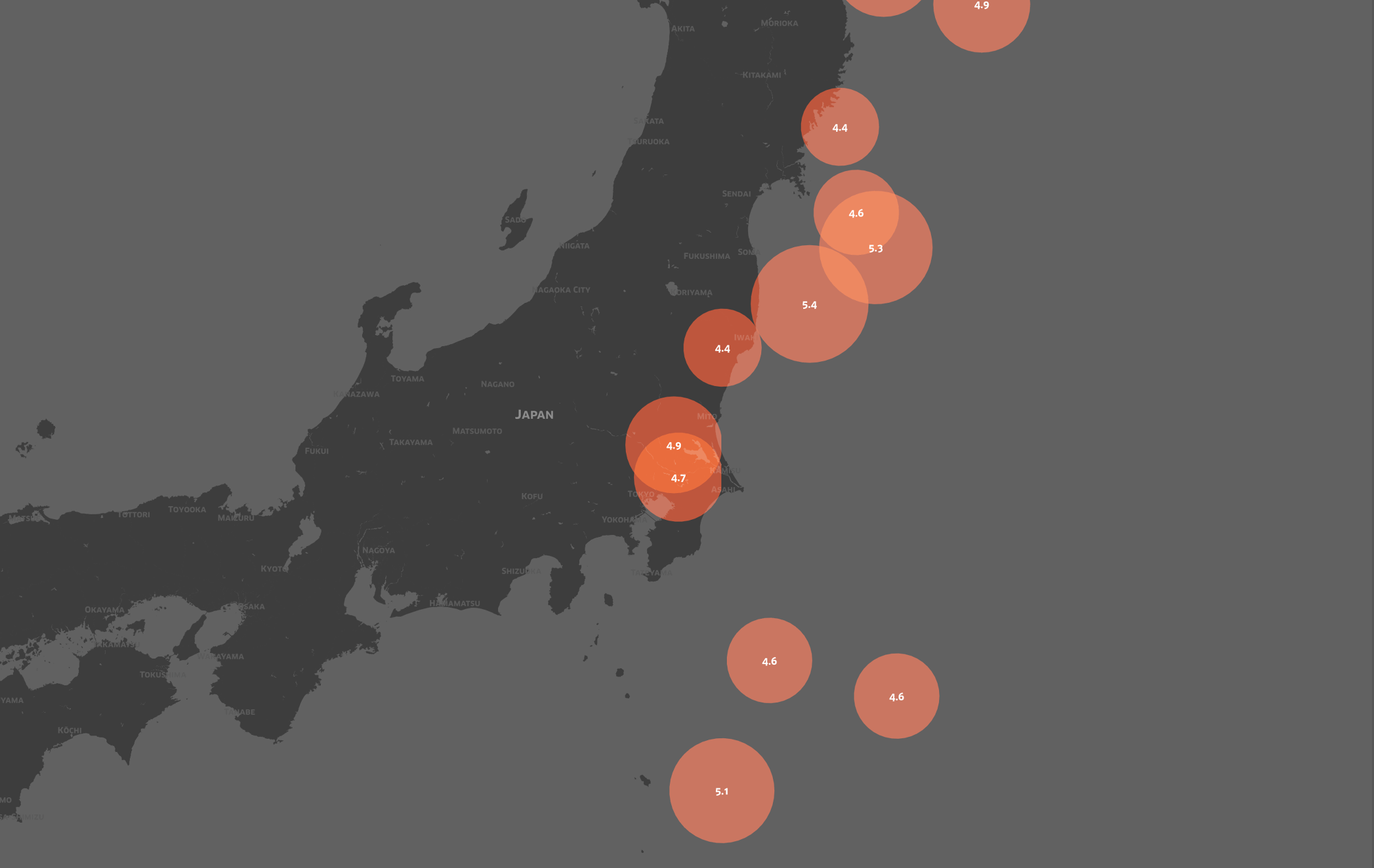
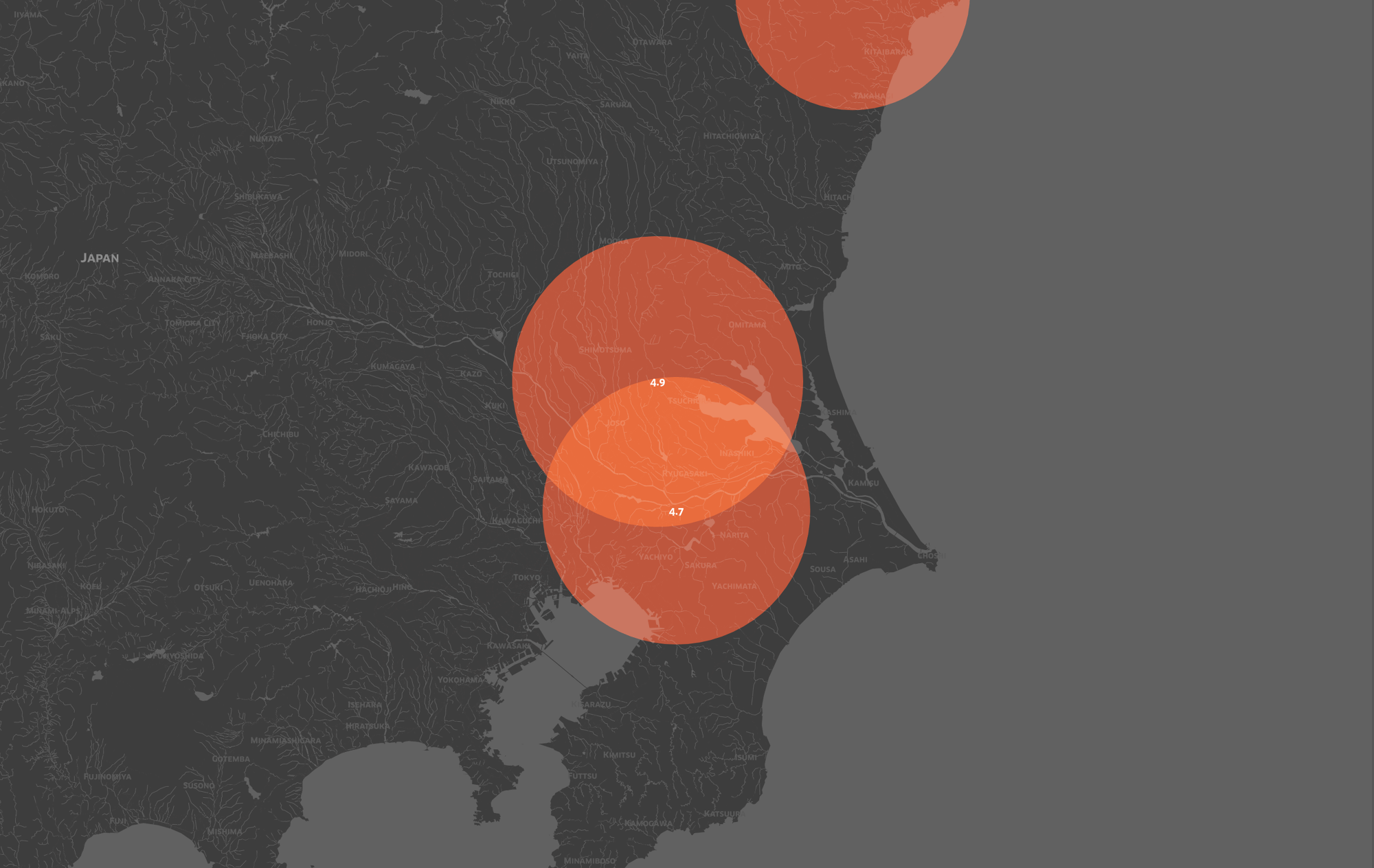
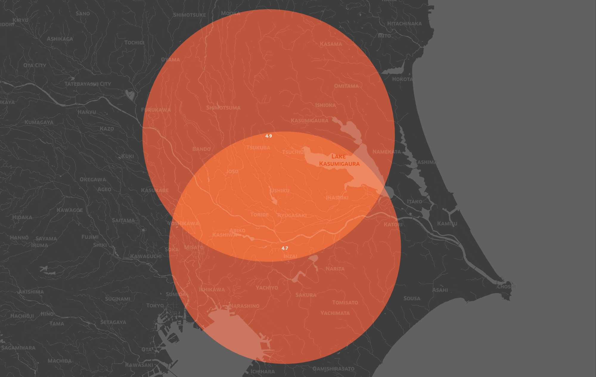
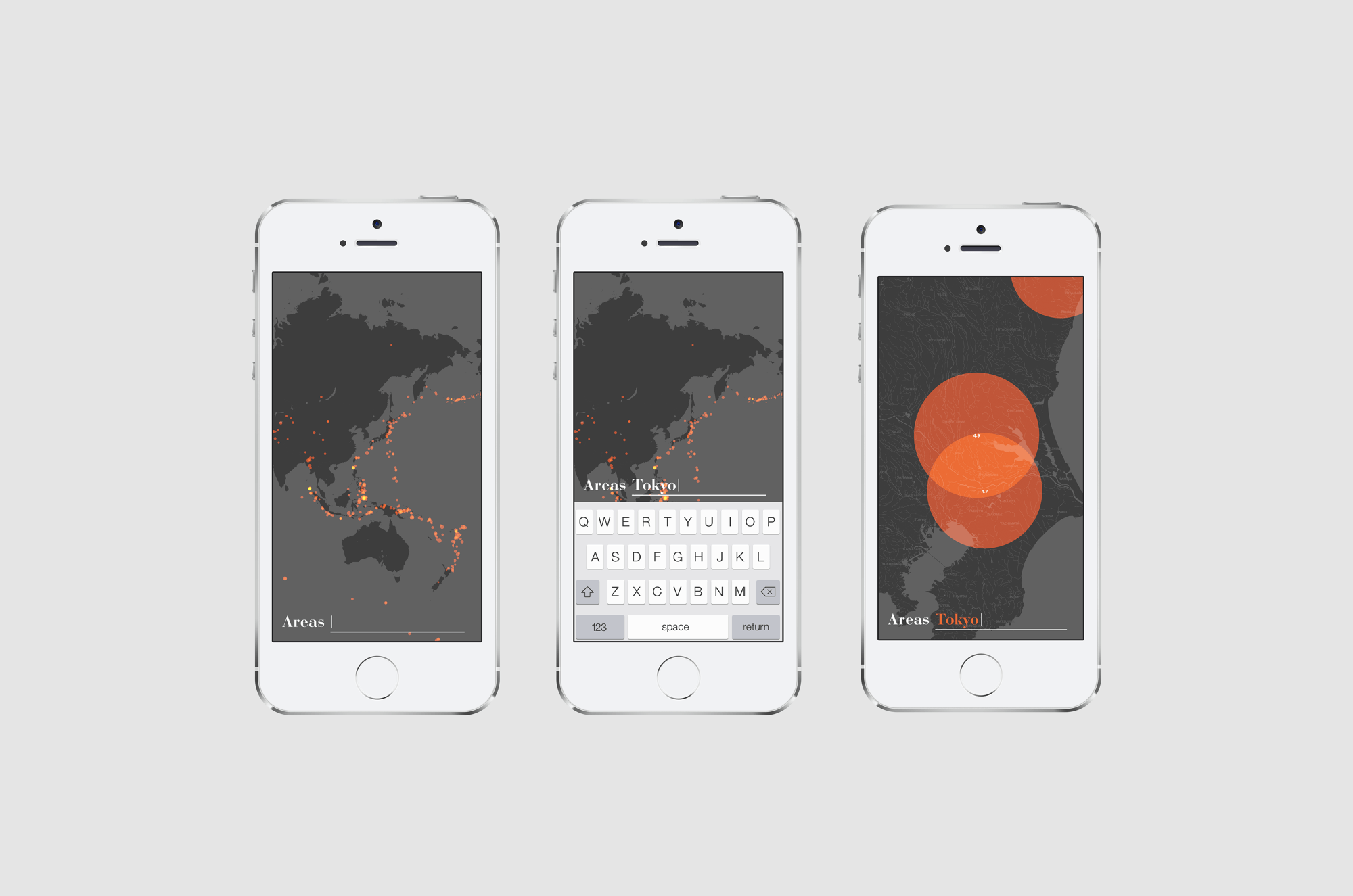
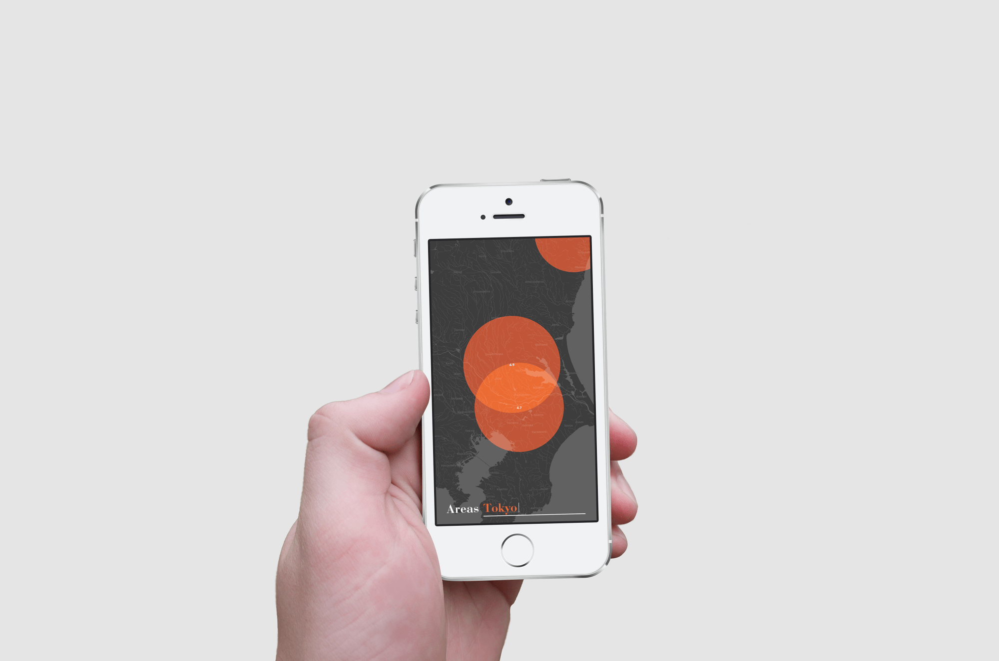
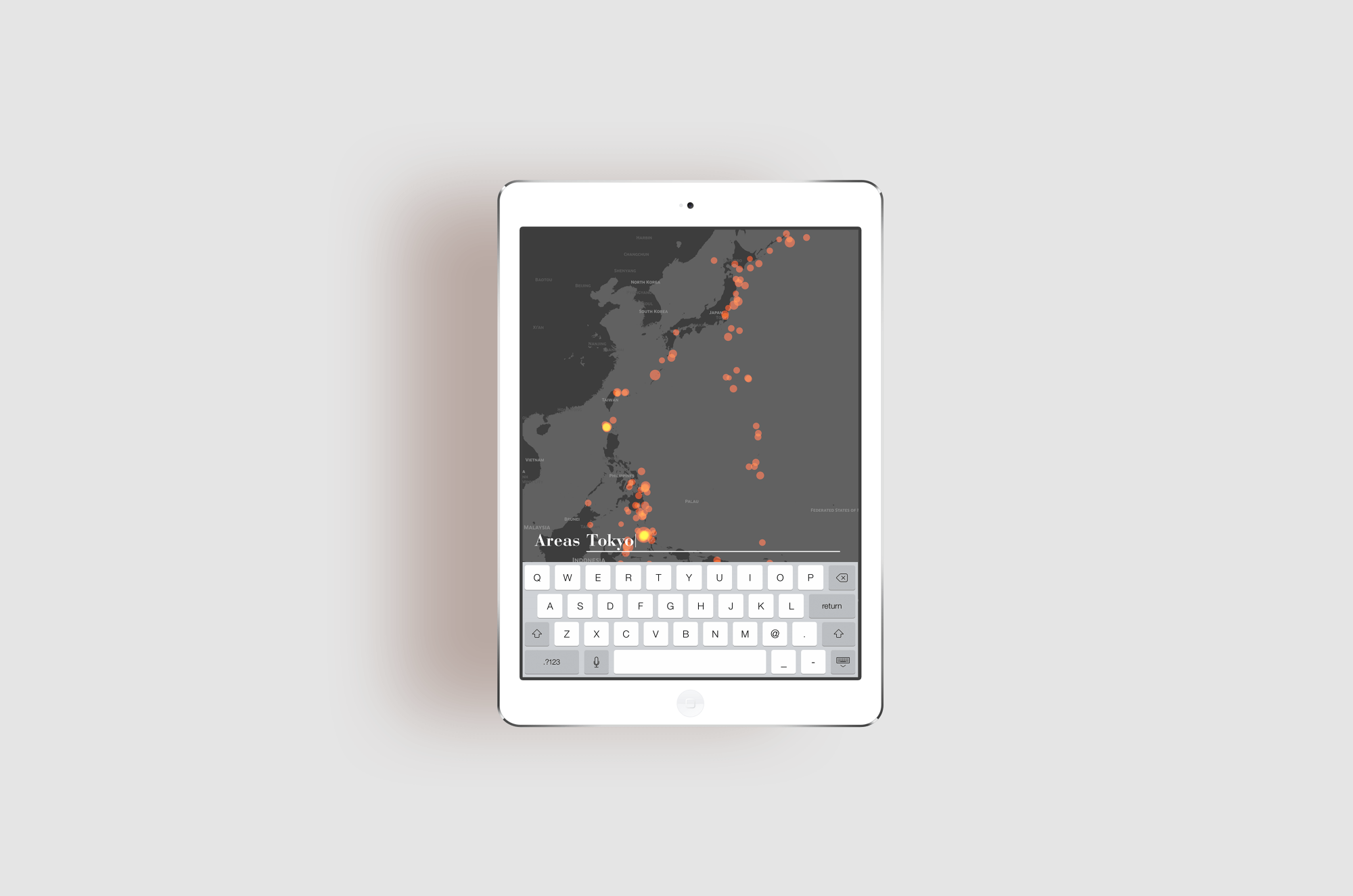
USGS↗으로 불리는 미국 지질 조사국를 통해 정확한 규모와 범위를 가진 지진 데이터를 수집하였습니다. 2014년 10월 21일 22:04:16.400 UTC부터 11월 20일 18:36:01.500 UTC까지 한 달 동안 발생한 지진 데이터를 분석했으며, 특히 규모 2.5 이상의 지진으로 정리하였습니다. 이후, 데이터를 보다 효과적으로 시각화하기 위해 지면을 그레이 계열의 컬러로 표현하고, 지진 발생 범위를 레드 컬러의 원으로 표시하여 강한 시각적 대비를 통해 정보의 가독성과 식별성을 높였습니다. 사용자는 스크롤 및 확대·축소 기능을 활용한 직관적인 제스처 조작을 통해 원하는 지역으로 쉽게 이동하거나 상세한 정보를 확인할 수 있도록 설계하였습니다. 또한, 특정 지역의 지진 정보를 보다 편리하게 확인할 수 있도록 지역명 검색 기능을 추가하여, 원하는 지역의 지진 데이터를 즉시 조회할 수 있도록 하였습니다.
I collected earthquake data with accurate magnitudes and ranges through United States Geological Survey Called USGS↗. I analyzed earthquake data recorded over a one-month period, from October 21, 2014, at 22:04:16.400 UTC to November 20, 2014, at 18:36:01.500 UTC, specifically focusing on earthquakes of magnitude 2.5 or higher. To enhance data visualization, I designed the map by displaying the ground in gray tones and representing earthquake occurrences with red circles. This strong visual contrast improves readability and makes it easier to identify affected areas. The interface allows users to navigate effortlessly using intuitive gestures such as scrolling and zooming, enabling them to move across regions or examine detailed earthquake information seamlessly. Additionally, to make earthquake data more accessible, I incorporated a location search feature, allowing users to instantly retrieve earthquake data for any specific region they wish to check.
IBM XiV E-brochure