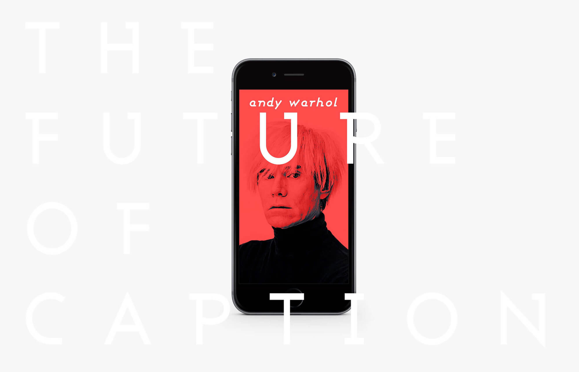
Next Caption
넥스트 캡션은 런던 커뮤니케이션 대학교의 인터렉션 디자인 커뮤니케이션 석사 과정 과제 중 하나로, 갤러리와 박물관 관람객의 모바일 기기를 기반으로 작품을 설명해주는 '모바일 도슨트' 프로젝트입니다. 이 프로젝트는 관람객이 더욱 세심하고 풍부한 미술 감상을 할 수 있도록 지원하는 동시에, 전시와 관련된 다양한 콘텐츠를 제공하여 보다 즐겁고 몰입감 있는 관람 경험을 선사하는 것을 목표로 삼았습니다. 이 시스템을 통해 관람객은 더이상 도슨트 시간에 맞춰 대기하거나 라디오 기기의 음성 설명에만 의존할 필요 없이, 누구나 각자의 모바일로 손쉽게 작품 정보를 확인하고, 더욱 풍성하고 자유로운 전시 경험을 누릴 수 있습니다.
Next Caption is a project developed as part of the Master’s program in Interaction Design Communication at the London College of Communication. This 'mobile docent' project leverages visitors’ mobile devices to provide detailed explanations of artworks in galleries and museums. The project aims to support visitors in having a more attentive and enriched art viewing experience while offering a wide range of engaging content related to the exhibitions. With this system, visitors no longer need to wait for scheduled docent tours or rely solely on audio guides provided by radio devices. Instead, anyone can easily access detailed information about the artworks through their mobile devices, enjoying a more flexible and immersive exhibition experience.
Year
2016
OS
Web
Company
Personal
Role
PM (100%), Product Designer (100%)
질문
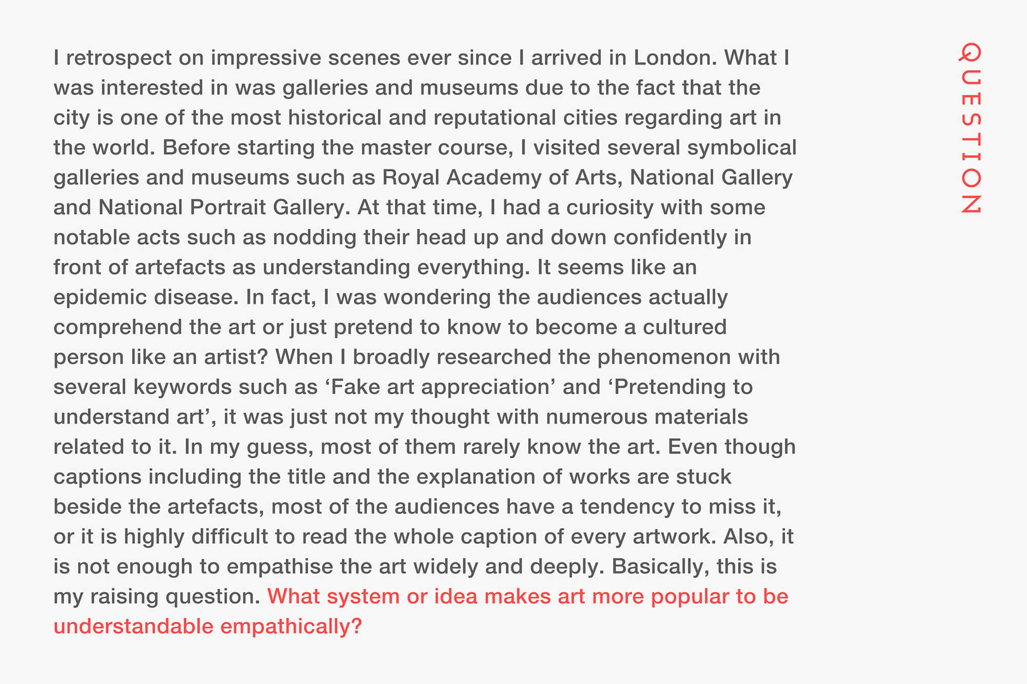
관람객이 갤러리나 박물관에서 정말 작품을 깊이 공감하고 이해할까
런던은 전 세계에서 예술과 관련하여 가장 역사적이고 유명한 도시로 자연스럽게 갤러리와 박물관에 관심을 가졌습니다. 그리고, 영국 왕립 예술원, 내셔널 갤러리, 내셔널 초상화 갤러리와 같은 상징적인 갤러리와 박물관들을 방문하며 관람객들이 작품 앞에서 모든 것을 이해하고 있다는 듯 자신감 있게 고개를 끄덕이는 모습에 흥미를 느꼈습니다. 관람객들이 실제로 예술을 이해하고 있는지, 아니면 단지 예술가처럼 문화적인 사람으로 보이기 위해 아는 척을 하고 있는지에 대해 궁금증을 갖게 되었습니다. 이후, '가짜 예술 감상'과 '예술을 이해하는 척하기'와 같은 키워드를 중심으로 현상을 조사한 결과, 이는 단순히 저만의 생각이 아니라는 점을 알게 되었습니다. 다양한 자료를 통해, 대부분의 관람객이 사실 작품에 대해 깊은 이해를 가지고 있지 않다는 것을 확인할 수 있었습니다. 작품 옆에 제목과 설명이 포함된 캡션이 붙어 있음에도 불구하고, 많은 관객들이 이를 놓치거나 모든 작품의 캡션을 읽는 것을 어려워하는 경우가 많았습니다. 심지어 캡션을 읽는다 하더라도, 그것만으로 작품을 널리 공감하고 깊이 이해하기에는 한계가 있다는 점도 깨달았습니다. 이러한 문제 의식을 바탕으로, 어떻게 하면 예술을 보다 공감적으로 이해하고 쉽게 접근할 수 있을지에 대한 고민이 시작되었습니다. 그리고 이 질문에 대한 답을 찾기 위해 본 프로젝트를 진행하게 되었습니다.
London is one of the most historically significant and renowned cities in the world for art, which naturally led me to take an interest in galleries and museums. I visited iconic institutions such as the Royal Academy of Arts, National Gallery, and National Portrait Gallery, where I became intrigued by the way visitors confidently nodded in front of artworks as if they fully understood them. This made me wonder whether they genuinely comprehended the art or were merely pretending to, in an effort to appear cultured like an artist. Later, I conducted research on this phenomenon using keywords such as “Fake art appreciation” and “Pretending to understand art,” and I discovered that this was not just my observation but a widely discussed issue with ample evidence supporting it. Through various materials, I came to understand that most visitors rarely possess a deep understanding of the art they view. Even though captions with titles and descriptions are placed next to artworks, many visitors tend to overlook them or find it challenging to read every caption thoroughly. Furthermore, even when captions are read, they often fall short of enabling a deeper emotional and intellectual connection with the artwork. This growing awareness of the problem prompted me to ask: how can art be made more accessible and emotionally engaging for audiences? To address this question, I embarked on this project to explore potential solutions.
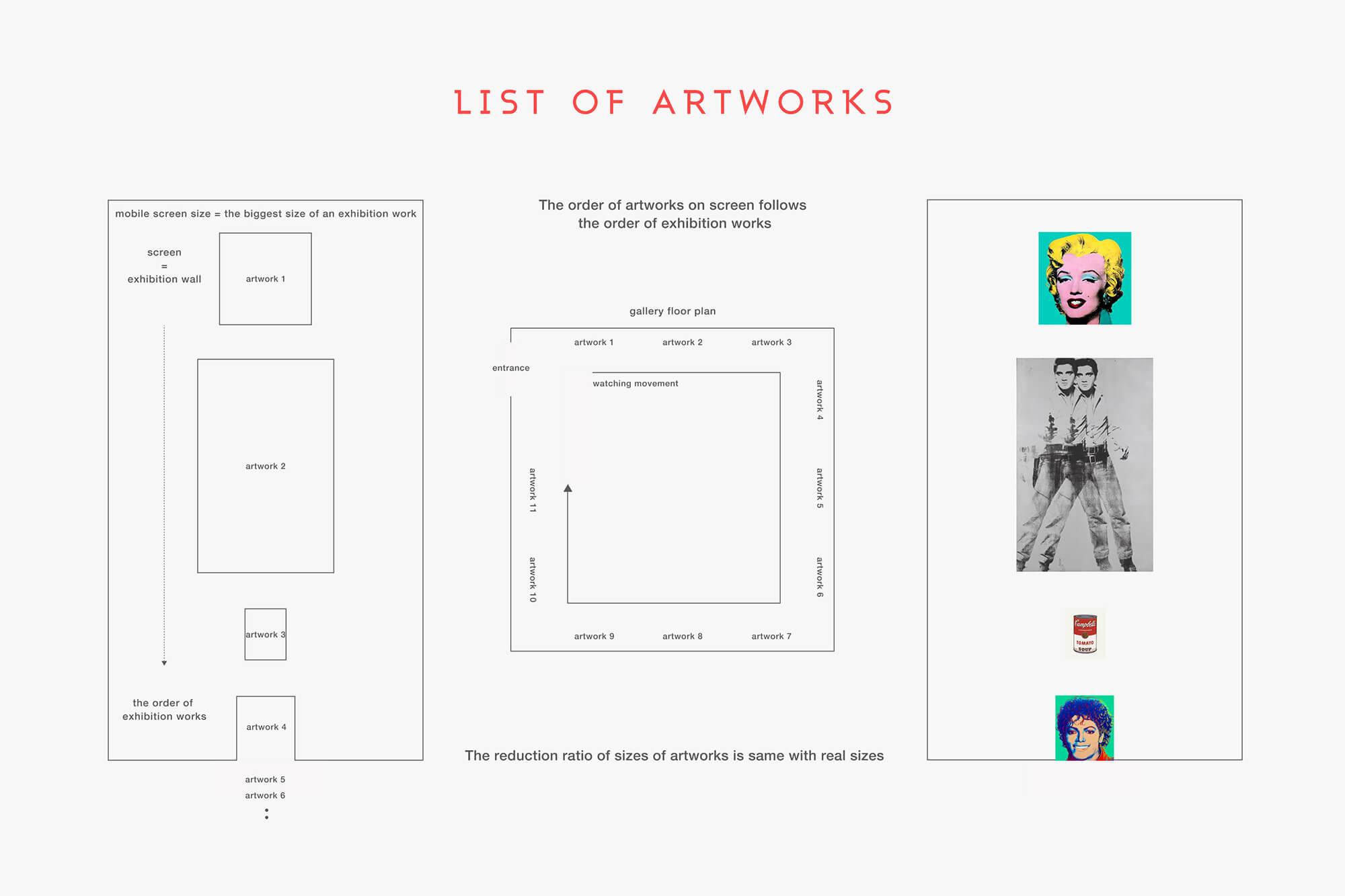
작품 배치
작품 관람 순서와 상대적인 크기를 기반으로 작품을 확인할 수 있다
관람객이 전시장에 입장하면, 갤러리나 박물관은 안내 요원, 표지판, 또는 바닥에 표시된 동선을 통해 관람객이 전시를 효과적으로 감상할 수 있도록 설계된 동선을 제공합니다. 이러한 점을 고려하여, 홈 화면에서 전시장에서의 관람 동선을 따라 전시 작품을 순차적으로 배치되었습니다. 또한, 각 작품의 크기를 상대적인 비율로 계산하여, 관람객이 작품의 크기를 시각적으로 예상하며 감상 경험을 더욱 몰입감 있게 즐길 수 있도록 설계하였습니다.
When visitors enter an exhibition hall, galleries and museums provide carefully designed routes to guide them through the exhibits effectively, using staff, signs, or floor markings. Taking this into account, the home screen is designed to display the exhibition pieces in a sequence that follows the viewing route in the gallery. Additionally, the relative sizes of each piece are calculated, allowing visitors to visually anticipate the scale of the artworks and enjoy a more immersive viewing experience.
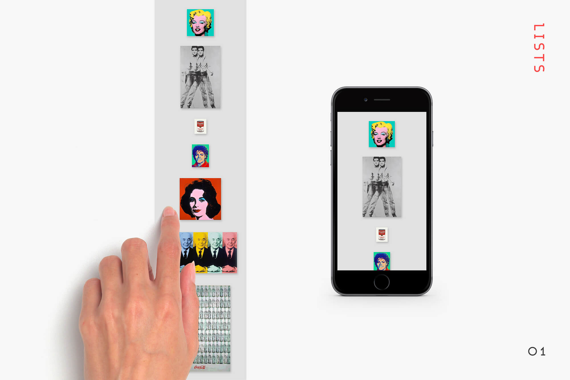
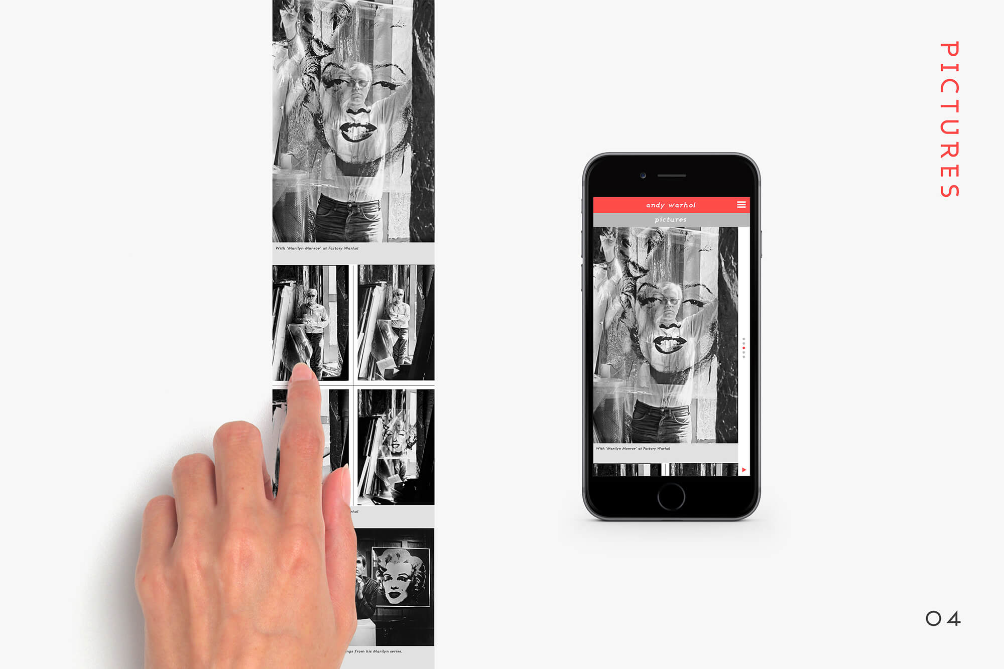
인터페이스
세로 스크롤로 각 작품의 콘텐츠를 가로 스와이프로 다음 작품을 쉽게 감상할 수 있다
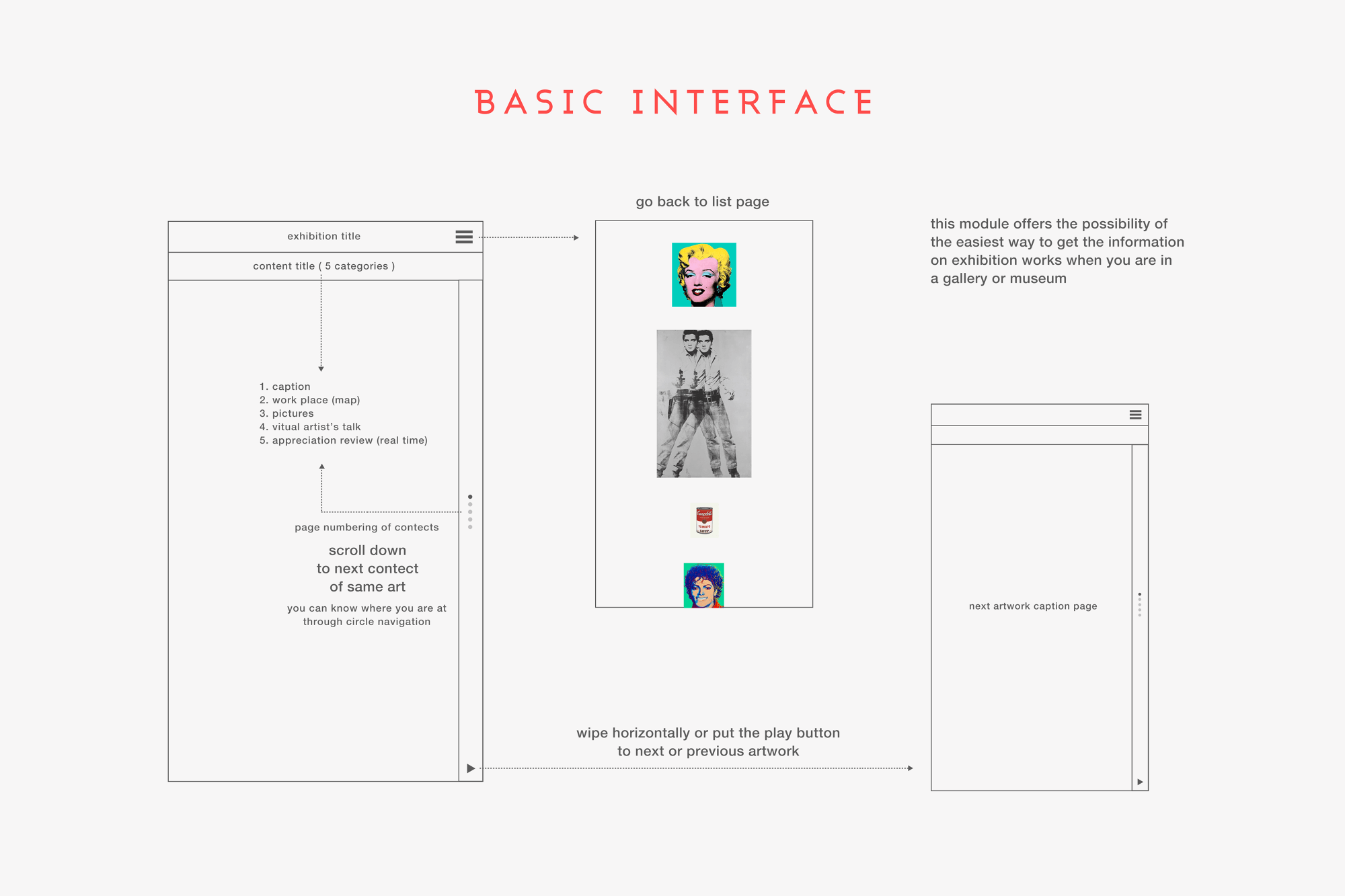
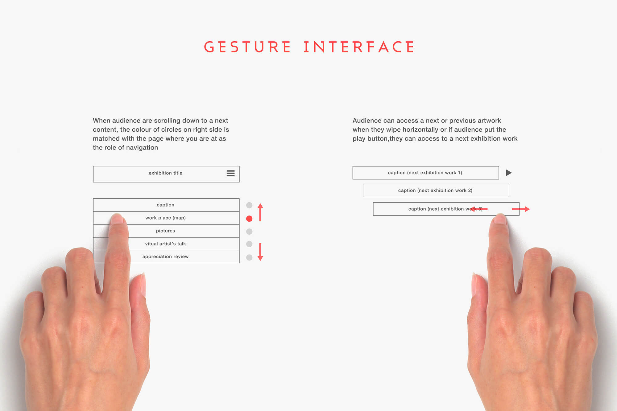
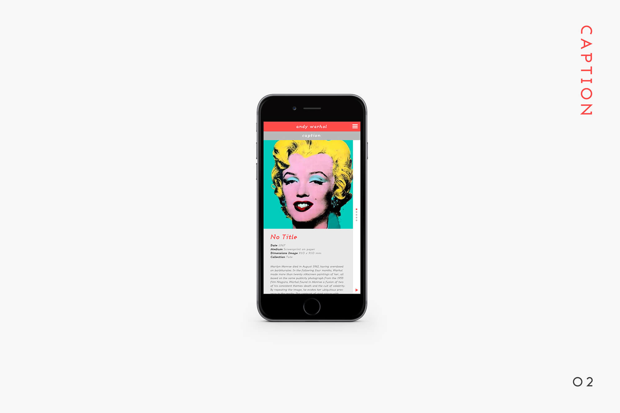
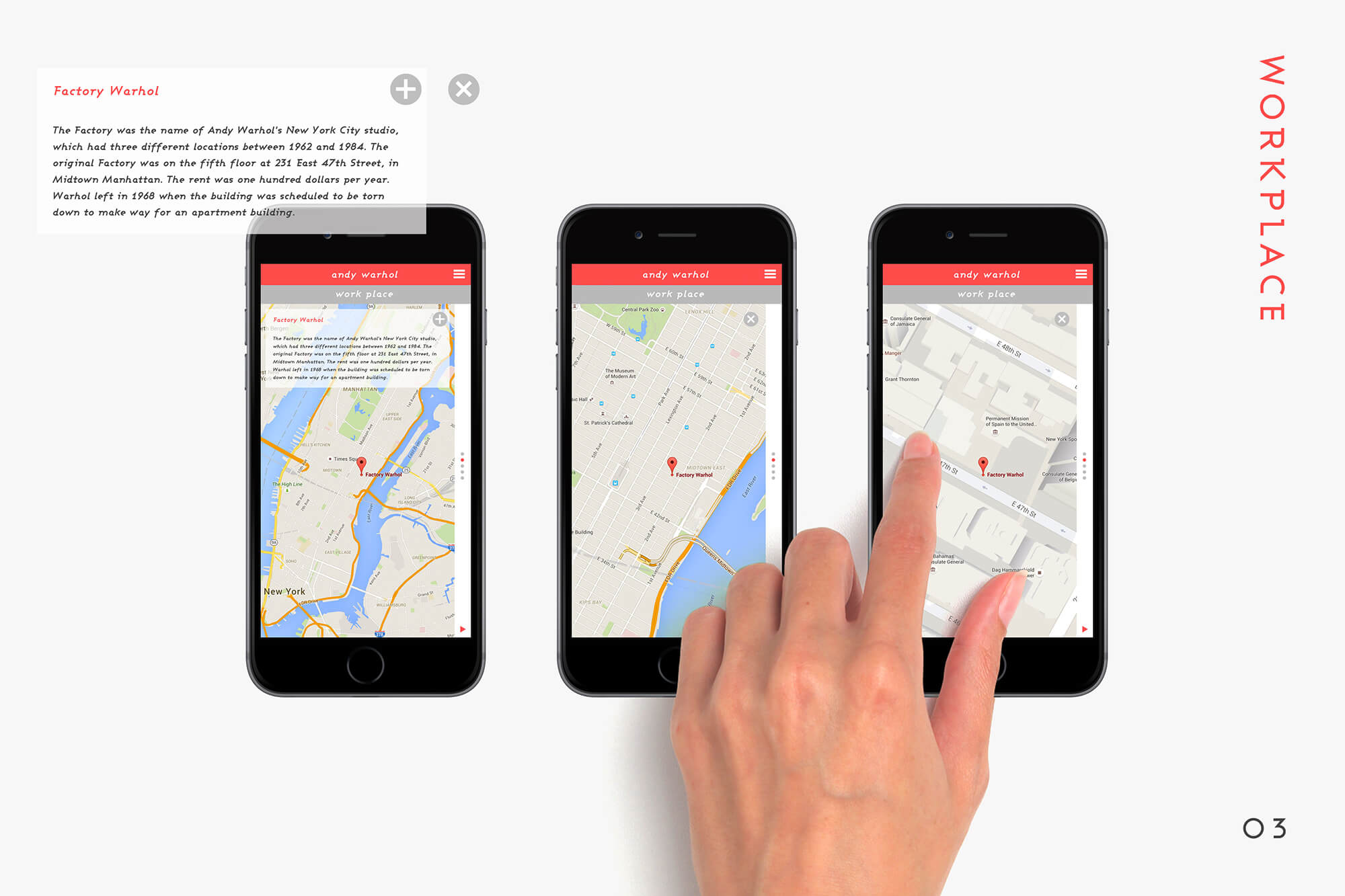
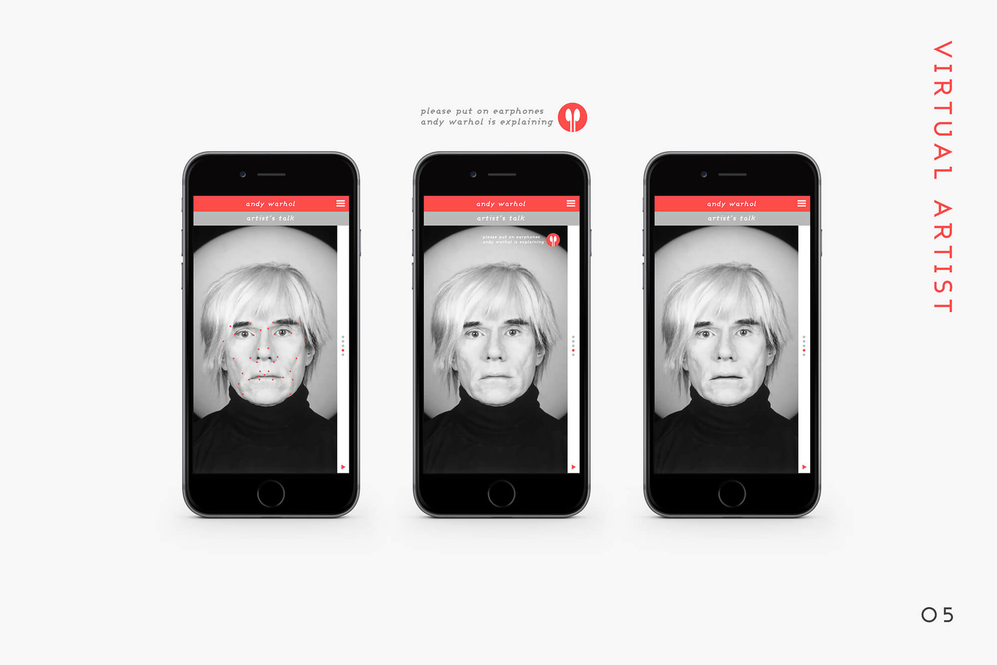
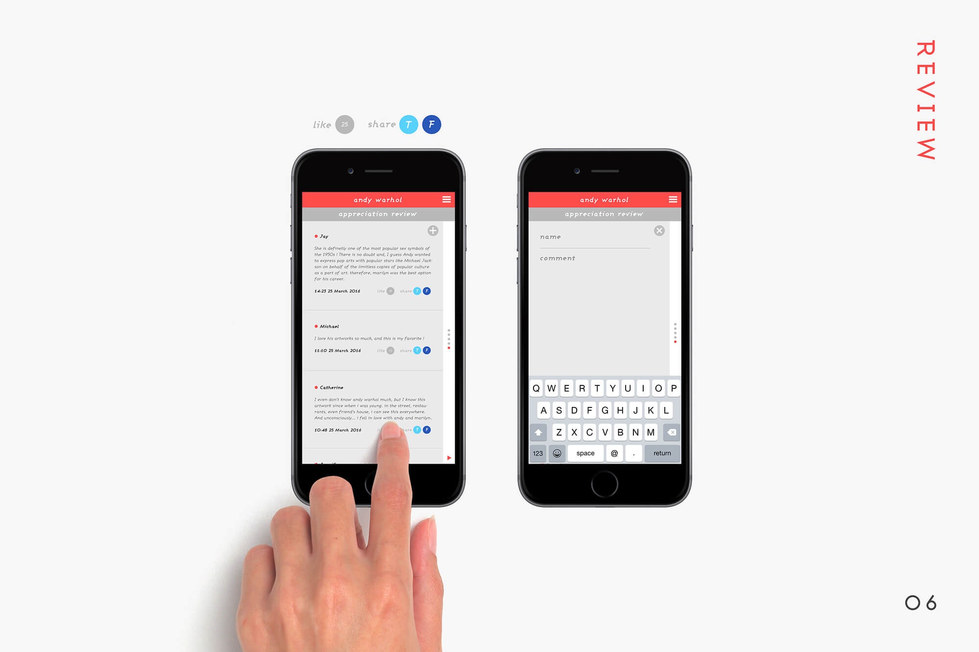
각 작품 별로 5가지 카테고리의 콘텐츠를 제공하고 있습니다: 캡션, 작품의 작업 공간(지도 기반), 작가의 작업 과정 중 촬영된 사진, 작가의 실제 목소리를 활용한 음성 설명, 그리고 관객이 실시간으로 업로드한 미술 감상 리뷰. 기본 인터페이스 시스템은 직관적인 제스처를 중심으로 설계되었습니다. 사용자는 세로 스크롤을 통해 콘텐츠를 이동할 수 있으며, 가로 스와이프를 통해 다음 전시 작품으로 자연스럽게 넘어갈 수 있습니다. 이러한 간단한 제스처는 사용자가 전시 작품을 쉽고 편리하게 탐색할 수 있도록 돕습니다.
Each artwork provides content across five categories: captions, workspace of the artwork (map-based), photos taken during the artist's creative process, audio descriptions featuring the artist's actual voice, and real-time art reviews uploaded by visitors. The basic interface system is designed around intuitive gestures. Users can scroll vertically to navigate between contents and swipe horizontally to seamlessly move to the next exhibition piece. These simple gestures enhance the ease and convenience of exploring the artworks.
Search Earthquake